Citi Bike is a privately owned bike share program serving a number of cities, including New York City, which is the location of this analysis. The program collects anonymous data on its users and their bike usage, and they make that information available to the public for analysis.
Citi Bike must know how much supply and demand there will be for their service on any day. Therefore, I was interested in creating a predictive model to provide an answer to this question.
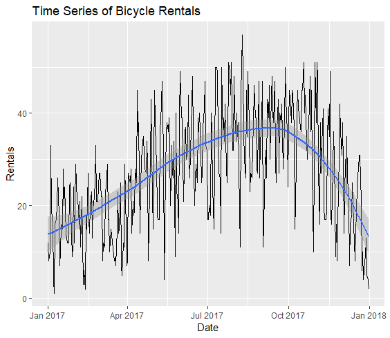 Figure 1
The Datasets:
To perform this analysis, I am combining three datasets. The first collection is from Citi Bike itself, which contains users’ basic customer information and trip histories. There are 16.3 million records over the course of 12 months in this collection, dated from January 1st, 2017 to December 31st, 2017.
The second dataset contains daily weather data obtained from the National Oceanic and Atmospheric Administration (NOAA).
The third dataset is a list of bank holidays and their corresponding dates. Bank holidays are days in which the banks are closed due to a recent holiday, and which are subsequently viewed as public holidays. Note that if a holiday (such as New Year’s Day) falls on a Sunday, the bank holiday would be the following day (Monday). See Table 1 for the full list of variables analyzed in this project. See Table 2 to view a sample of my pre-processed “training” dataset- the dataset which will be used as a measure for predicting future bicycle rentals.
| Variable Alias | Variable Name | Data Type | Used in Final Analysis |
|---|---|---|---|
| Weekday/Weekend | isWeekend | Categorical | X |
| Bank Holidays | holiday | Categorical | X |
| Precipitation (inches) | PRCP | Quantitative | X |
| Average Temperature (°F) | TAVG | Quantitative | X |
| Average Wind Speed | AWND | Quantitative | - |
| Rentals Per Day* | freq | Quantitative | X |
| Date | Freq | AWND | PRCP | TAVG | isWeekday | Holiday |
|---|---|---|---|---|---|---|
| 2017-01-01 | 12 | 5.59 | 0.00 | 44.0 | 1 | 0.0 |
| 2017-01-02 | 8 | 9.17 | 0.21 | 39.0 | 0.0 | 1 |
| 2017-01-03 | 10 | 10.74 | 0.58 | 41.0 | 0.0 | 0.0 |
| 2017-01-04 | 33 | 8.05 | 0.00 | 43.0 | 0.0 | 0.0 |
| 2017-01-05 | 19 | 7.83 | 0.00 | 30.5 | 0.0 | 0.0 |
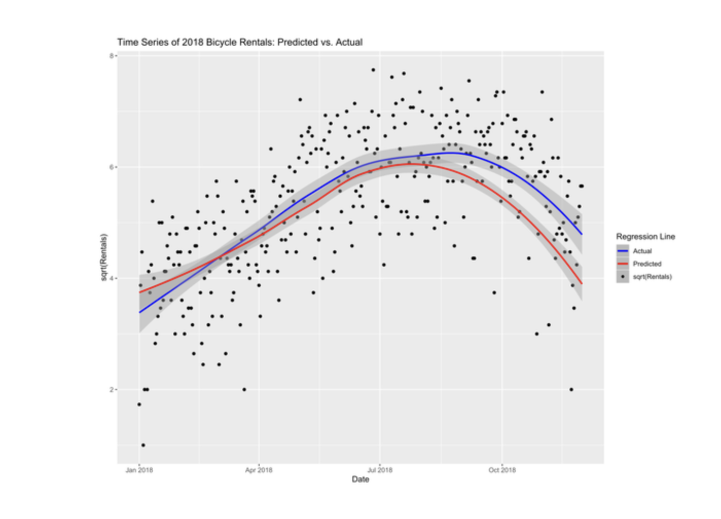
A fourth dataset was also obtained from Citi Bike, which includes data on rentals from January 1st, 2018 to November 30th, 2018. December 2018 data was not available at the time of this analysis. This dataset will be used as a “test” set, to assess how accurately the 2017 model will predict rentals in 2018.
Data Cleaning Steps:
After loading the necessary packages in R for data cleaning, analysis, and visualization (ggplot2, plyr, pastecs, ppcor, mctest, and plotrix), I read in all Citi Bike data into 12 separate tables (each table being a month’s worth of rentals). R is a case sensitive language; because some of the columns did not have standardized capitalization across tables, I had to set them all to lowercase before performing a join. I then removed all columns that were not applicable to my analysis. From there, I removed all records where an NA value occurred. I then queried the dataset to show only records where the user type was a subscriber to the program; as there were not many single-day users in the system, I did not want this difference to adversely affect my analysis (Figure 2).
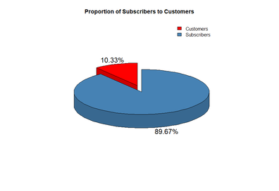 Figure 2
I then removed observations where trip durations were under 120 seconds (to account for broken bicycles). I also removed rows where trip durations were over 1 hour to account for stolen bicycles and to remove outliers (as it is not economically justifiable to rent a bicycle for over 45 minutes due to extra fees incurred) (Citi Bike, 2018). These did not occur often in the dataset, so their removal is justified (Figure 3).
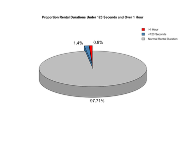 Figure 3
I then formatted my date column to match the weather dataset formatting in preparation for dataset merging, and then extracted the weekday for each record. I categorized these weekdays according to “weekday” and “weekend”. Because I wanted to analyze the differences between weekday and weekend rentals in a regression analysis, I converted these factors into integers, with “weekend” valued at 1, and “weekday” valued at 0.
I then loaded the weather data I obtained from NOAA and performed an inner join on the two datasets, merging on the “rental date” column. After the join, I created a new column, which I populated with the average temperature of the day. This was calculated by finding the mean of the low and high temperatures in each observation.
Because I was working with millions of observations, I took a simple random sample of 10,000 records without replacement to improve my computing efficiency.
I then aggregated my records based on their dates. Each record would now represent the number of rentals on a particular day.
Finally, I joined my aggregated dataset with the bank holidays dataset on the “date” columns. All records that contained a holiday were given a value of 1, and those without a holiday were given a value of 0.
| Value | freq | AWND | PRCP | TAVG | isWeekday | holiday |
|---|---|---|---|---|---|---|
| nbr.na | 0 | 0 | 0 | 0 | 0 | 0 |
| min | 1 | 1.12 | 0 | 14.5 | 0 | 0 |
| max | 57 | 18.34 | 3.03 | 85.5 | 1 | 1 |
| range | 56 | 17.22 | 3.03 | 71 | 1 | 1 |
| sum | 10000 | 1880.14 | 41.91 | 20477 | 105 | 10 |
| median | 28 | 4.92 | 0 | 57.5 | 0 | 0 |
| mean | 27.70083102 | 5.208144044 | 0.116094183 | 56.72299169 | 0.290858726 | 0.027700831 |
| SE.mean | 0.647898856 | 0.120091085 | 0.017951362 | 0.878559458 | 0.023936254 | 0.008649582 |
| CI.mean | 1.274141992 | 0.236168181 | 0.035302708 | 1.727753471 | 0.047072449 | 0.017010055 |
| var | 151.5380271 | 5.206294601 | 0.116332758 | 278.6438866 | 0.206832872 | 0.02700831 |
| std.dev | 12.31007827 | 2.281730615 | 0.341075883 | 16.69262971 | 0.454788821 | 0.164342053 |
| coef.var | 0.444393826 | 0.438108201 | 2.937923972 | 0.294283309 | 1.56360728 | 5.932748098 |
| Value | PRCP | TAVG | AWND | isWeekend | holiday |
|---|---|---|---|---|---|
| PRCP | 1 | ||||
| TAVG | 0.010548 | 1 | |||
| AWND | 0.190215 | -0.50814 | 1 | ||
| isWeekend | 0.02758 | -0.04937 | -0.02004 | 1 | |
| holiday | -0.0159 | -0.05694 | 0.086437 | -0.1081 | 1 |
| Value | VIF | Tolerance |
| AWND | 1.4328 | 0.6979 |
| PRCP | 1.0571 | 0.9460 |
| TAVG | 1.3781 | 0.7256 |
| isWeekday | 1.0186 | 0.9818 |
| holiday | 1.0204 | 0.9800 |
Justification for the use of Multiple Regression:
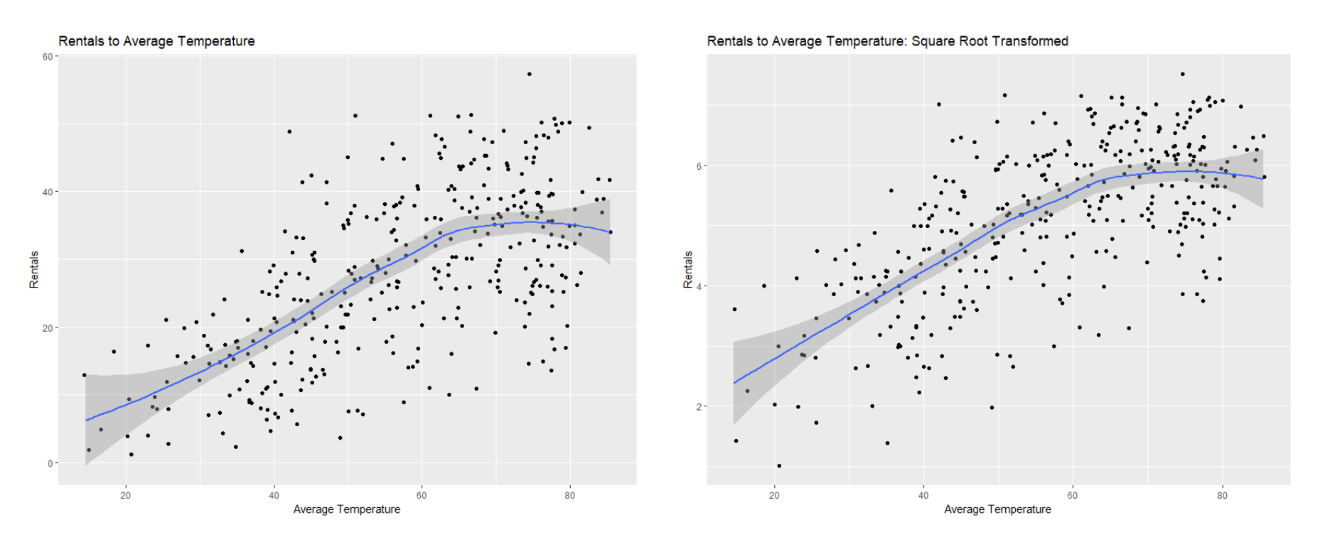
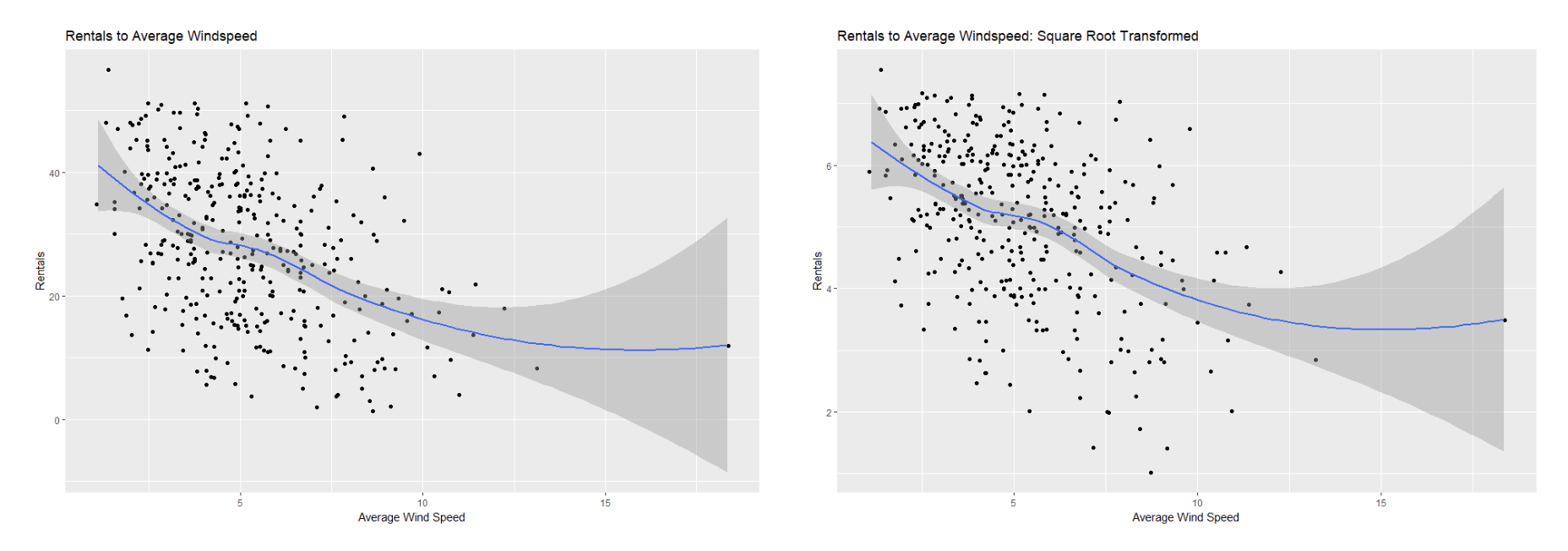
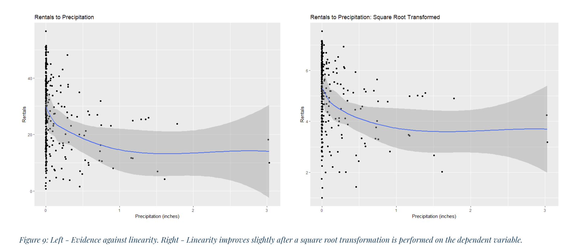
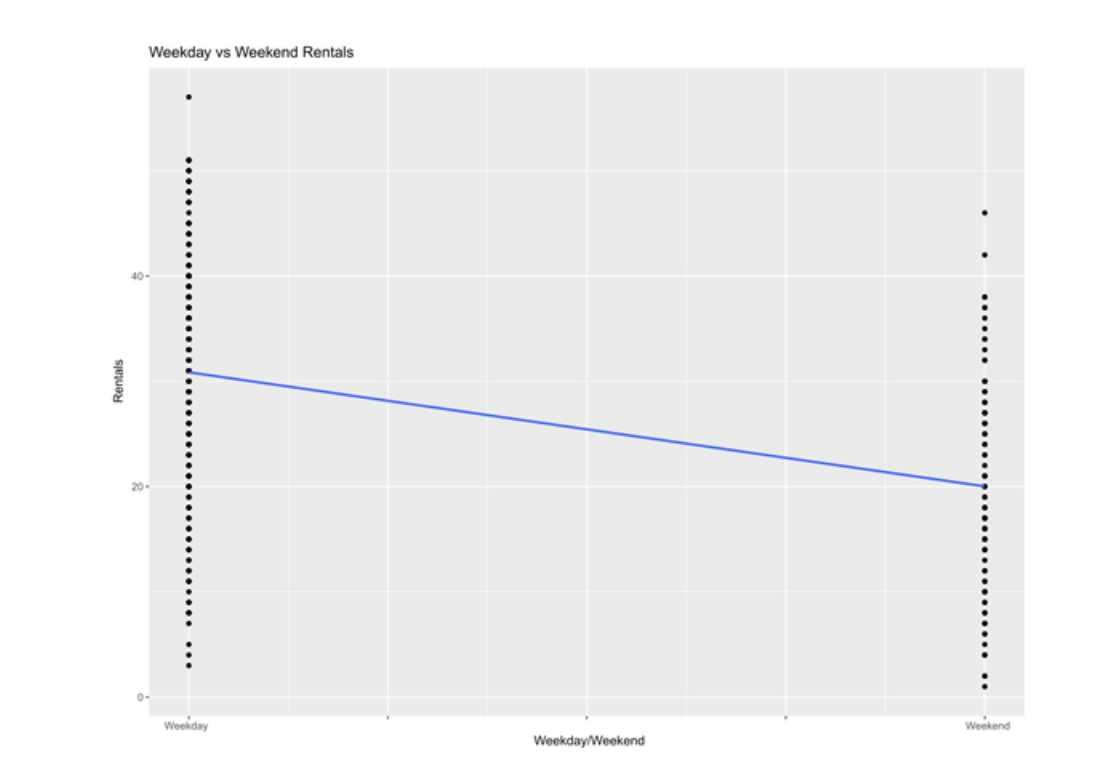
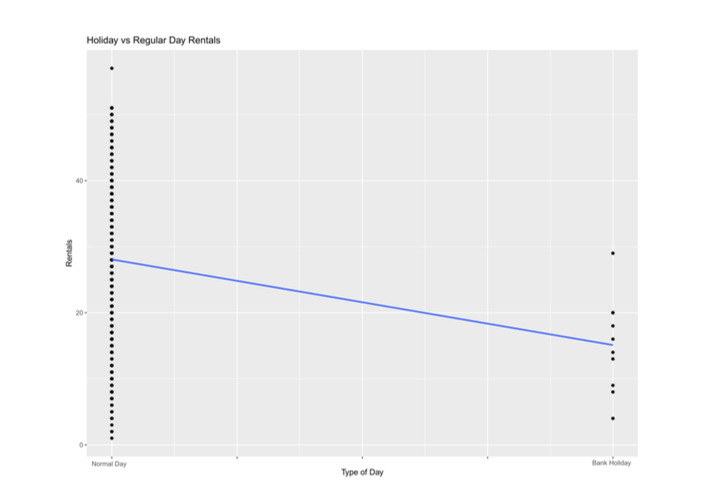
I decided to use multiple regression as my statistical technique because I wanted to predict a quantitative value (number of rentals per day) based on a combination of quantitative and categorical variables. Though my sample showed evidence of heteroscedasticity (see Figure 6), I found it could be remedied somewhat through a square root transformation of the dependent variable (see Figure 7). Similarly, the square root transformation also improved linearity between my independent variables and the dependent variables (see Figures 8 – 15). Additionally, among my independent variables I found scant evidence of multi-collinearity from the tolerance and VIF techniques, and only found moderate correlation from the AWND variable as it related to the TAVG variables, as seen from the the Pearson Correlation Matrix (see Table 4). Additionally, I found my dataset to be close enough to normal- and even more so after the square root transformation- to rationalize utilizing the regression method (see Figures 4 and 5).


Analyses and Results:
To analyze each independent variable’s contribution to the strength of the regression line, I created several regression equations, incrementally adding variables to subsequent equations and measuring their impact on the R2 and adjusted R2 values. My final model output and interpretations is as follows:
| Slope Estimate | Std. Error | t-value | p-value | |
| (Intercept) | 2.842370 | 0.146923 | 19.346 | < 2e-16 |
| TAVG | 0.048033 | 0.002404 | 19.977 | < 2e-16 |
| PRCP | -0.947616 | 0.117355 | -8.075 | 1.06e-14 |
| isWeekday | -1.073883 | 0.088655 | -12.113 | < 2e-16 |
| holiday- | 1.442509 | 0.245367 | -5.879 | 9.50e-09 |
R2: 0.6543
Adjusted R2: 0.6504
Model P-value: < 2.2e-16
Square root transforming the dependent variable improved the adjusted R2 values from 0.632 (not shown) to 0.6504 by reducing heteroscedasticity. This new value implies that the independent variables explain 65% of the variability in Y. The overall model p-value is extremely statistically significant.
Conclusion:
The final regression model does an okay job at predicting bicycle rentals given the available set of independent variables and explains approximately 65% of the variability in the square-root-transformed dependent variable.
In the end, though, I did not use all my available independent variables; I decided to remove the average wind speed variable (AWND) from the final model. Though AWND is significant at the 0.01 level as seen in Table 11, it straddles the threshold, casting doubt on its fit in the model- especially given that all other independent variables have extremely low p-values. And though AWND has a low VIF and high tolerance scores which suggest low combined multi-collinearity, it still shows moderate-to-high correlation with the average temperature (TAVG) variable as shown in the Pearson Correlation Matrix. Additionally, its inclusion in the dataset has only marginally increased the adjusted-R2 value by less than 0.01. Therefore, I have decided to remove it from my final model.
There remain some limitations in the analysis. There were issues of linearity between the quantitative independent variables and the dependent variable that could not be completely resolved through the square root transformation of the dependent variable. This issue of linearity is likely due to, in part, how weather affects rentals; as temperature approaches high extremes, rentals begin to decrease instead of continuing to rise (Figure 8). As can also be seen from Figure 8, there are individuals who will continue to rent from the program system regardless of low temperatures. The addition of new variables into the analysis, such as air pollution or daily pollen measurements, could potentially have improved the predicting power of the model, as well.
Data Sources and References:
Citi Bike. (2018, December 10). Citi Bike. Retrieved from Index of Bucket “Trip Data”: https://s3.amazonaws.com/tripdata/index.html
Citi Bike. (2018, December 9). Citi Bike Membership & Pricing. Retrieved from Citi Bike: https://www.citibikenyc.com/pricing
NOAA. (2018, December 10). National Centers for Environmental Information. Retrieved from National Centers for Environmental Information: https://www.ncei.noaa.gov
shivaas. (2018, December 10). CSV for all US bank holidays till 2020. First row is the header. Dates are MYSQL format. Retrieved from Git Hub: https://gist.github.com/shivaas/4758439