This collaborative project between myself and Priyanka Verma seeks to gain insights from particulate matter air pollutant trends in the New York Metropolitan Area. Specifically, we look at particulate matter that is less than 2.5 micrometers (PM2.5), and only data obtained during winter months, due to the higher level of PM2.5 during that season. We developed this in a way that should be easy to reproduce and understand.
Study Area
Our study area includes part of the New-York Metropolitan Area, including New York City, Long Island, counties in Upstate New York, and large portions of New Jersey. These areas were determined by the New York Core Based Statistical Area (NY CBSA).
Data
PM2.5 data has been provided by the Environmental Protection Agency (EPA), and can be found through the open data portal: https://www.epa.gov/outdoor-air-quality-data/download-daily-data.
The CBSA boundary shapefile can be obtained from the United States Census Bureau.
Software Packages and Libraries
To begin the analysis, first load the packages we will be using for this project. Please type in install.packages(“PACKAGE_NAME_HERE”) for each package you do not already have locally installed (all those used in this project are listed below). Then, run the code chunk below:
library(sf) # offers an exceptional data structure for storing GIS vector data
library(tidyverse) # compilation of packages curated to make data cleaning easy
library(raster) # data structure for storing raster data and preprocessing functions
library(gstat) # package for interpolating data
library(lubridate) # provides functionality for working with dates and times
library(plyr) # provides extra data cleaning functions
library(tmap) # interactive visualization functionality for geospatial data
library(rasterVis) # provides enhanced plotting functions for raster data
library(RColorBrewer) # enhanced and customized palettes for visualizing data
library(reshape) # provides extra functionality for data cleaning
library(Kendall) # provides acccess to Mann-Kendall modeling
library(EcoGenetics) # provides access to Theil-Sen modeling
library(imager) # easy plotting of non-spatial image files, like .BMP or .PNG
Data Pre-Processing
The raw data used in this analysis spans a 10-year period, from January 1st, 2010 to April 12th, 2020. Air quality data was sampled at each location at least once every few days, making it a near-daily data set. To focus on the yearly winter season, the data was filtered based on the December - March months. The mean PM2.5 value was obtained for each time index (season). Users of this tutorial are encouraged to test view the output of each intermediate step to better understand how the workflow operates.
# Reads all csv files in this directory
data = list.files(path="data", pattern="*.csv", full.names=TRUE)
# Merges all csv files into a single dataframe for analysis
data_all = ldply(data, read_csv)
# replace spaces in column names with '_'
names(data_all) <- gsub(" ", "_", names(data_all))
# rename latitude & longitude columns
names(data_all)[names(data_all) == "SITE_LONGITUDE"] <- "x"
names(data_all)[names(data_all) == "SITE_LATITUDE"] <- "y"
# Convert to date format for filtering
data_all$Date <- data_all$Date %>% as.Date("%m/%d/%Y")
# extract year from Date as a new column for yearly interpolation
data_all[, "year"] <- format(data_all[,"Date"], "%Y")
# filter for winter months
df_winter <- data_all %>%
  filter(strftime(data_all$Date, "%m") %in% c('12','01','02','03'))
Spatial Conversion
The shapefile for the CBSA is first loaded into the R working environment. Then, sampling locations were extracted from the .csv file of PM2.5, and converted into a spatial object.
# read in cbsa shapefile
nycbsa <- st_read("data/ny_cbsa.shp")

# convert sites to an sf object using projection from cbsa
epa_sites <- df_winter %>%
  distinct(Site_ID, x, y) %>%
  st_as_sf(coords = c("x", "y"), crs = st_crs(nycbsa))
Explore Metropolitan Area & Air Pollution Monitoring Sites
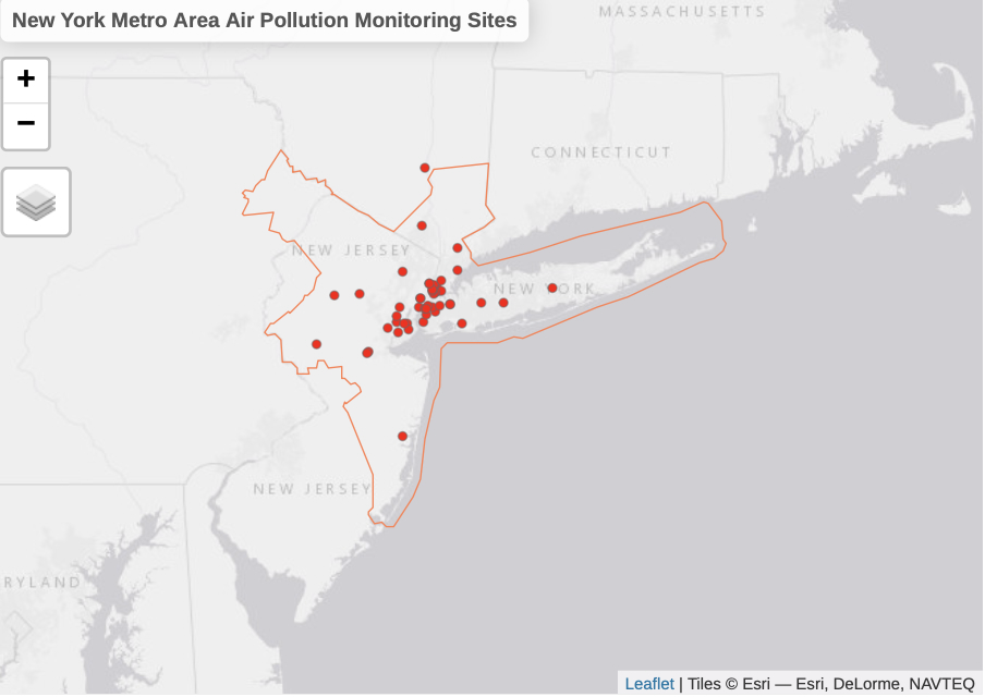
This chunk of code visualizes the sampling locations and the overarching area of interest. Monitoring site that falls outside the CBSA boundary will be removed from the analysis.
tmap_mode("view")

tm_shape(nycbsa, name = "NY Metropolitan Area", is.master = TRUE) +
  tm_borders(col= "coral") +
  tm_layout(title = "New York Metro Area Air Pollution Monitoring Sites") +
  tm_shape(epa_sites, name = "EPA Air Monitoring Sites") +
  tm_dots(col="red")
Let’s take a look at our inputs:
Rasterize
The NYCBSA data object is currently in the form of a vector file, but needs to be converted into a raster image to create an interpolation surface. This code chunk uses the rasterize function from the raster library for this conversion, and then plots our area of interest.
# create a raster file with resolution of 0.01 for ny metro area
target <- raster(x = extent(nycbsa), crs = crs(nycbsa), res = 0.01)
# assign value of 1 to each pixel
values(target) <- 1
# crop raster surface to NY metro region
nycbsar <- nycbsa %>% rasterize(x = ., y = target, field = "GEOID")
# plot for visual check
par(mar = c(1, 0, 0, 4))
plot(nycbsar, axes = FALSE, box = FALSE, legend = FALSE)

Interpolation
There needs to be a few more preprocessing steps to ready the dataset for analysis, and then use the gstat function to perform an inverse distance weighting (IDW) interpolation.
# assign year to winter months
# if jan-march, assign to previous year, else assign same year
df_winter$winter <- ifelse(format(df_winter$Date, "%m") == "12",
                           df_winter$year,as.numeric(df_winter$year)-1)
# create a list of all winter years
years <- unique(df_winter$winter)

# Interpolate for each winter season
# Calculate mean for every site for each winter season
# int_df.list: List of dataframes with mean PM2.5 for each winter
# invdist.list List of interpolated surfaces for each winter
int_df.list =list()
invdist.list = list()
for (each_year in years){
  # calculate mean for every site for each winter season
  int_df <- df_winter %>%
  filter(winter == each_year) %>%
  group_by(Site_ID, winter, x, y) %>%
  summarise_at(vars(Daily_Mean_PM2.5_Concentration),
               list(PM_Mean = mean))
  # add dataframe to list
  int_df.list[[each_year]] = int_df

  # inverse distance interpolation for each year
  # create a gstat object
  invdist <- gstat(id = "PM_Mean",
                   formula = PM_Mean ~ 1,
                   locations = ~x + y,
                   data = int_df)
  # generate interpolated layer
  invdistr <- interpolate(object = nycbsar, model = invdist)
  # mask to metro area
  invdistrmsk <- mask(x = invdistr, mask = nycbsa)
  # add interpolated layer to list
  invdist.list[[each_year]] = invdistrmsk
}
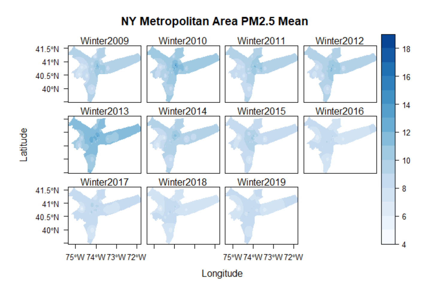
Plotting the Interpolated Layer
# create a stack for all interpolated layers for plotting
s <- raster::stack(invdist.list)
# edit name for each layer
names(s) <-  gsub(x = names(s), pattern = "X", replacement = "Winter")
# set up theme for plot
mapTheme <- rasterTheme(region=brewer.pal(8,"Blues"), rev=TRUE)
# plot interpolated layers
levelplot(s, pretty = TRUE,  main="NY Metropolitan Area PM2.5 Mean", par.settings=mapTheme)
Saving Interpolated Raster Images as .RST
for (i in 1:length(s@layers)){
  writeRaster(s[[i]], filename = paste0("terrset/", names(s[[i]]), ".rst"),
              overwrite = F)
}
Histogram
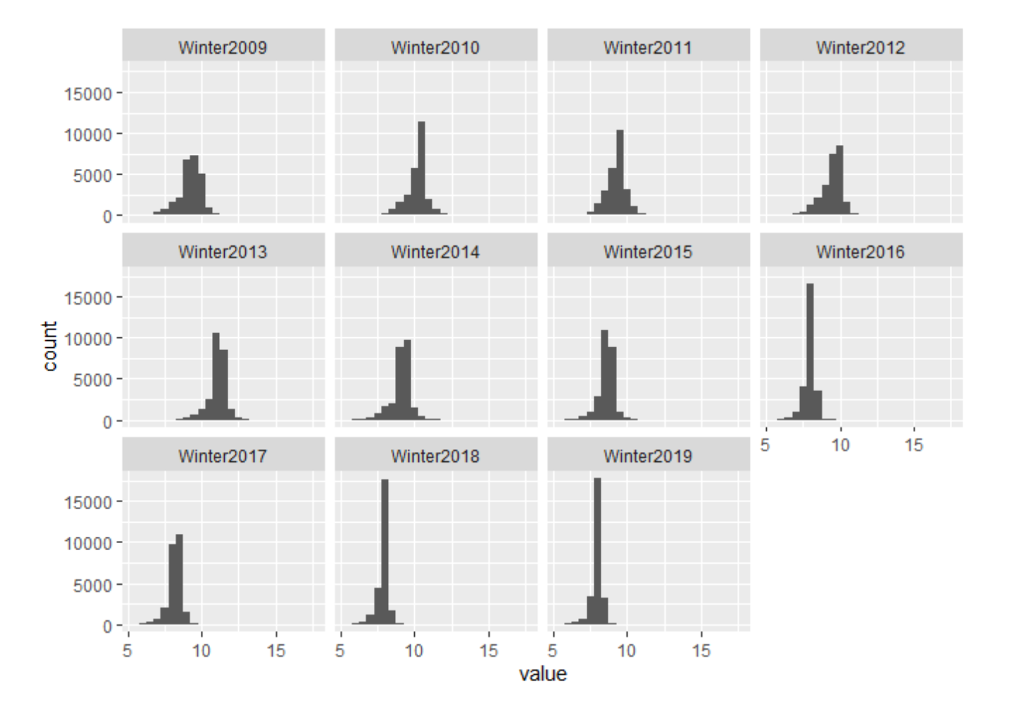
Histograms are a great way to view how PM2.5 measurements change year-to-year within the study area. Each bar represents a sampling location and the amount of PM2.5 measured there. You can see some sampling locations with increasing PM2.5 values over the 10-year time span, while others have decreasing PM2.5 values.
# raster stack to dataframe for each x, y
# remove NA values
stack_df <- as.data.frame(s, xy = TRUE, na.rm = TRUE)%>%
  melt(id.vars = c('x','y'))

# histogram for interpolated layers
par(mfrow=c(4,2))
ggplot(stack_df) +
  geom_histogram(aes(value), binwidth = .5) +
    facet_wrap(~variable)
Mann-Kendall Trend Test: Tau & P-Value
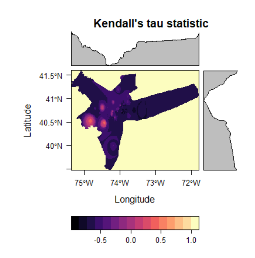
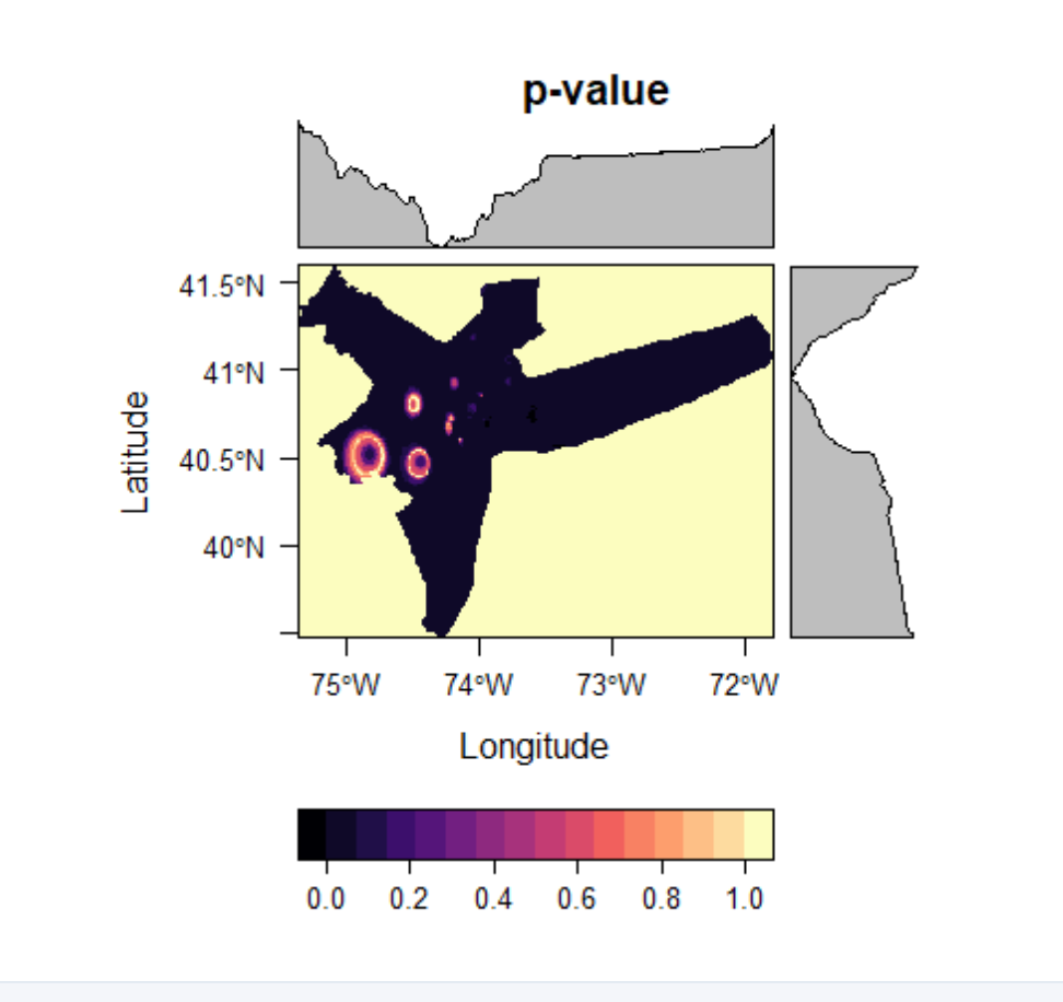
A Mann-Kendall model is a non-parametric test similar to a pearson correlation analysis. Ranging from +1 to -1, a positive tau value indicates an increasing trend while a negative tau value indicates a decreasing trend. The higher the absolute tau value, the more consistent that trend is. This helps us answer the question, “where are PM2.5 measurements falling, and where are they rising?”
# function for Mann-Kendall trend test
kendall = function(x){return(unlist(MannKendall(x)))}
# apply function to raster stack. RUN THIS CHUNK IN CONSOLE ONLY
# takes too long in markdown and ignore "WARNING: Error exit, tauk2. IFAULT =
# 10" warning. Output has been validated in TerrSet, and this message appears
# to be a bug in the package. For simplicity, an R object (.rds file) has been
# saved to the working directory, which contains the output for the Mann-Kendall
kendall_output = calc(s,kendall)

# Save output to a .rds file
#saveRDS(kendall_output, file = "kendall_output.rds")
Because of some bugs running the above code chunk in an R-Markdown file, we recommend running the above chunk in the R console specifically. If you continue to have trouble running the above code (e.g, the code infinitely runs without stopping after a few minutes), we have provided the output for you as a .rds file which can be easily read into RStudio.
These file types are useful in R; they can be read in directly into your global environment using the same data structure it was created in, without running any further conversions or data processing steps, saving time and preventing potential bugs in your code. To save this file, we have have used the saveRDS() function seen above. If you are familiar with Python programming, saveRDS() is analogous to pickle.dump() from the pickle Python package.
In any respect, we recommend trying to run the code from the above chunk first. If you have trouble using that code, you can instead load in the provided file using this code here:
kendall_output <- readRDS("output/kendall_output.rds")
Plotting Mann-Kendall Output and saving to .RST
The levelplot() function for raster images can be considered to be an upgrade to the generic plot() function. It provides enhanced functionality and better visualizations.
Notice that the kendall_output data structure is that of a RasterBrick. RasterBricks are similar to RasterStacks. In both, you can store multiple raster images within the object, allowing for easier file organization and analysis. To access raster images within a brick, type the name of the object, followed by a dollar sign and the name of the raster you are searching for.
# plot Kendall's tau statistic
levelplot(kendall_output$tau, main = "Kendall's tau statistic")
# plot p-value
levelplot(kendall_output$sl, main = "p-value")
# write to rst
writeRaster(kendall_output$tau, filename = "output/tau.rst", overwrite=TRUE)
writeRaster(kendall_output$sl, filename ="output/mk_p-value.rst", overwrite=TRUE)
You may notice from these plots that at approximately 40.5N, 74.7W PM2.5 tends to increase consistently over the 10-year time frame, while other area see more consistently downward trends. Remember, however, that these estimates are very dependent on the interpolation method used. IDW was chosen for its simplicity for this tutorial, though other methods may yield more accurate results.
TerrSet Validation: Kendall Tau & P-Value
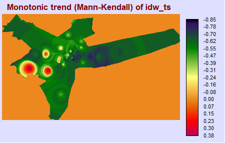
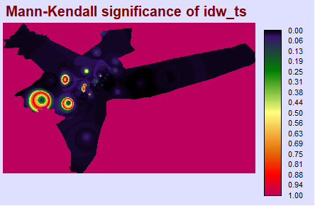
To ensure R is returning the values we expect (and that the package was not poorly written, or that there was some methodological flaw), it is good to compare results with those in software you may be more familiar with, such as TerrSet. After performing a Mann-Kendall test in the TerrSet Earth Trends Modeler, we have found the results between these two programs to be virtually identical.
ktau_img <- load.image("terrset/TERRSET_MK_TAU.BMP")
plot(ktau_img, axes = F)
mkp_img <- load.image("terrset/TERRSET_MK_P.BMP")
plot(mkp_img, axes = F)
Theil-Sen Median Trend Test
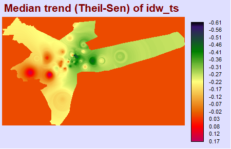
Knowing simply whether trends are increasing or decreasing is not necessarily enough. It is also useful to know the matgnitude, or rate at which trends are increasing. The Theil-Sen median trend analysis returns a slope for each pixel, which can tell us rates of change in our time series.
# saves two images automatically to working directory:
# pvalue, and slope of theil-sen.
# Note that this function takes at least 10 minutes of processing time
# to complete, so be prepared to wait.
eco.theilsen(s, dates = c(seq(from = 2009, by = 1, to = 2019)))
file.rename(from = "pvalue.tif", to = "theilsen_pvalue.tif")
file.rename(from = "slope.tif", to = "theilsen_slope.tif")
A Theil-Sen median trend image shows us the slope, or rate of change in a time series analysis. You can see that there is a positive rate of change located at approximately 40.5N, 74.7W, with negative rates of change elsewhere.
theilsen_slope <- raster("output/theilsen_slope.tif")
plot(theilsen_slope, main = "output/Theil-Sen Median Slope")

# write slope image to IDRISI raster format for easy comparison
writeRaster(theilsen_slope, filename = "output/theilsen_slope.rst", overwrite=T)
TerrSet Validation: Theil-Sen Median Trend
Similarly, we can validate our results in TerrSet, and we found the results from these two programs to be identical.
theilsen_slope_img <- load.image("terrset/TERRSET_THEILSEN_SLOPE.BMP")
plot(theilsen_slope_img)
